IA Model for NFL Mobile
Role: UX Designer
Tools: Omnigraffle, Optimalworkshop.com, Usertesting.com, Sketch, Principle
At the NFL, fans experience football through a various assortment of products and services that provides them with the latest and greatest in the sport. While a fan may enjoy the content they are served, how they find that content can vary drastically from platform to platform, sometime even reaching points of friction and frustration. I was tasked with bridging that experience gap -- developing a modern Information Architecture model that is universal yet flexible enough to handle the NFL's large array of content vehicles.
Clearing the Slate
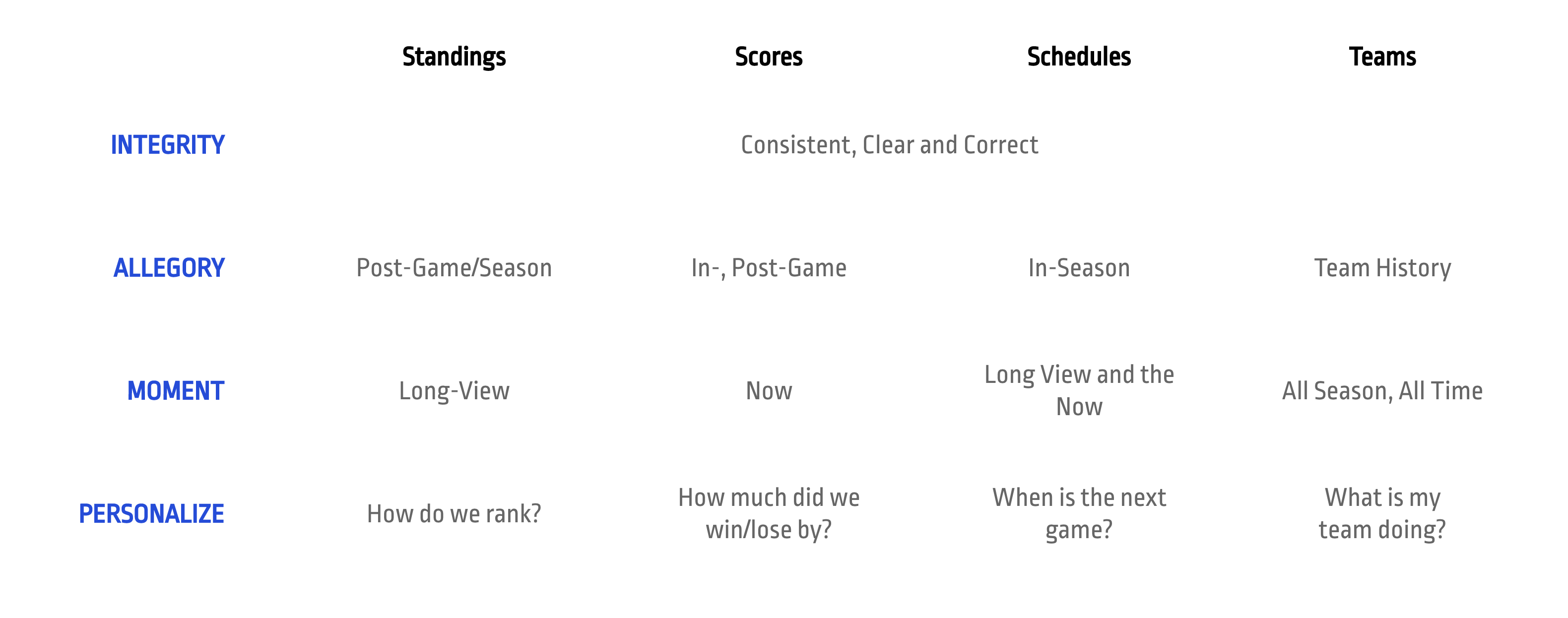
Prior to the start of the project, we sought to understand an avid football fan's behavior by looking at the prevailing analytics data for all products available to us. We determined that the primary pages a fan goes to for football data includes the Scores, Standings, Schedules and team profile pages. From here we wanted to understand the fan's mental model regarding these four topic pages. To find this, we ran a generative study and asked what they thought the page does, it's meaning to them, and the value it provides.
With the responses from this study, I was able to construct a mental model of how fans saw these pages along the following dimensions:
The Optimal Path and Taxonomy
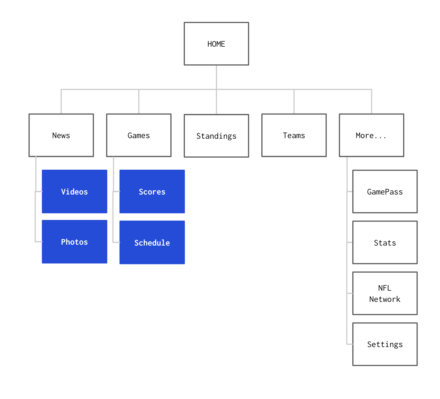
In order to determine the IA that best aligns with this mental model, I was put in charge of running several tree test studies to determine success rate and efficiency of the navigation, as well as to validate the taxonomy we used. These tests included one control as well as several sitemaps of various changes. After a couple of weeks of testing, I validated the results of the tree test with several open and closed card sorts — the winner of these tests was a variant of the sitemap which combined Scores and Schedules under 'Games', and Videos and Photos under 'News' — see below:
Determining our Interaction Patterns
Next is the question of how to handle the large amount of content that is available to fans. Because of the cross-platform requirement of the IA, the controls must contend with universality against flexibility to balance surface-level scanning and deep-dive grazing behaviors. After weeks of iteration, testing, and stakeholder feedback, we arrived at a control pattern that achieved a delicate balance.
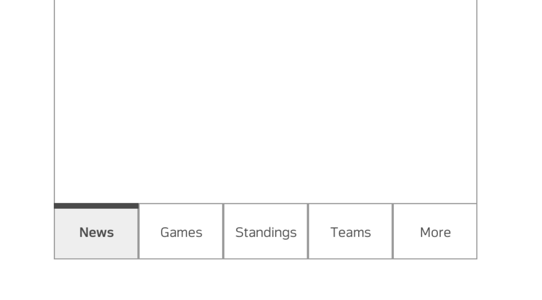
The first, and most obvious control layer was the tabbed navigation, located at the bottom of the screen. These bottom tabs represented the primary level of navigation -- News, Games, Standings, Teams and More (for overflow).
Due to the seasonality of the NFL, some pages may change in importance over the course of the year. This seasonality was reflected in tabbed navigation. For example, the 'Games' tab would become 'Playoffs' or 'Super Bowl' at the end of the season and reset to 'Combine' and 'Draft' after the old season ended and the new one began.
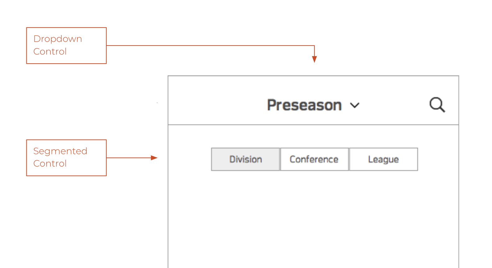
The 'Dropdown Control' represents the secondary level of navigation. This control is located at the top of the screen, functioning as a title with a down caret to the right of the title text to signal to the fan more content. The content inside of the dropdown will vary from section to section. For example, the Teams section will contain a list of all 32 teams in the league.
Finally, the 'Segmented Control' represents a change in view that might occur on screen, per page. For example the Standings page will have the option for seeing the information on screen in either a Division-, Conference-, or League-wide view. This control will remain inline, at the top of most pages.
Inventory of the IA
The final step is confirming everything works the way it is proposed. This meant building out and printing an app-wide inventory of every possible page and content type on the application for a 'bird eye view' of the project. The artifact is composed of a series a screen-specific wireframes and is categorized by section along the horizontal plane, and bisected by levels of navigation (primary, secondary, and tertiary) along the vertical. It also displays the way various sections handle their controls and changes to the navigation due to seasonality.
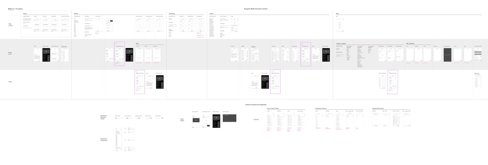
This artifact provides supplemental benefits to the UX team and acts as a sort of litmus test for proposed control patterns, allows for team-wide visibility and provides a prominent visual reference to managers, designers and engineers.
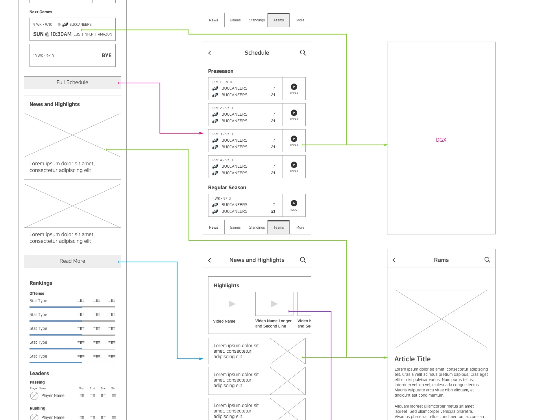
In addition to this IA inventory file, I have also included a 'wireflow' build of each of the individual sections. These diagrams presented primitive, in-section navigation from one screen to another and lay the foundation as reference to the larger UX team to build experiences off of. Below is an example of the Teams page:
Final Output
We developed a model that aligns with an avid fans behavior to either scan for surface level information or graze for deep dive information — a cross-application, flat hierarchy we've dubbed 'Breadth and Depth'. It is characterized, generally, by a simple parent/child page relationship, where a fan can get quick look information at the first level and more granular information at the second and third levels.
The work done on this project helped define the IA of, not just the NFL mobile product, but Dotcom and CTV.
The NFL app launched in June, 2018 and continues to be updated with features born out of this process.